MOONBOARD CLIMBING
May 2020 UX Case Study Solo Project
Background
Climbing is a sport that is drastically increasing in popularity every year. When not outdoors, many climbers go to indoor climbing facilities to practice and train their skills. However, one of the biggest downsides of climbing gyms is that they only have a limited amount of routes for climbers to use. The company, Moonboard, created a wooden board that allows climbers to create and share problems using an app. In this case study, I will be focusing on improving the app.
My Role
UX Designer
Tools Used
Figma, Photoshop, and Creately
My Role
Goal of the Project
My role throughout the project was the UX designer. I conducted both the research and redesign of the project.
The goal of the project was to reorganize pages and recreate UI elements to help improve user experience.
Research
For this case study, I conducted 10 interviews with different rock climbers. I asked them about their experiences with the app and improvements that they would like to see. I would give them scenarios and observe how they would navigate through the app.
Identifying Issues
The idea of working on this case study stemmed from using the app first-hand. I always found the app difficult to use because it took a lot of trial and error to figure out the function of each button and where to find certain features.
After realizing issues first-hand, I started to interview climbers that use the app. I interviewed 10 different climbers and wrote down the issues that they were experiencing. I also took time to read through many reviews that users have left on the Apple App Store.
Here are the issues
After conducting my research and interviews, here are the issues that I have discovered in the app.
1. Buttons
The app has buttons that can be confusing to the users. Some buttons are unclear in showing its functionality.
For example, the image on the right shows a page that appears to only have one button, the “create problem” button. However, the Moonboard logo serves as a back button. Many users that I have interviewed did not know that. This would cause them to restart the app.
2. Organization of Pages
With many different pages and features, the app can be hard to navigate through and find specific things.
The image on the left shows the menu page of the app. In my research, most of these features users do not use, or need right away. With all these different choices, it makes the user think and search longer for the feature that they need.
Personas
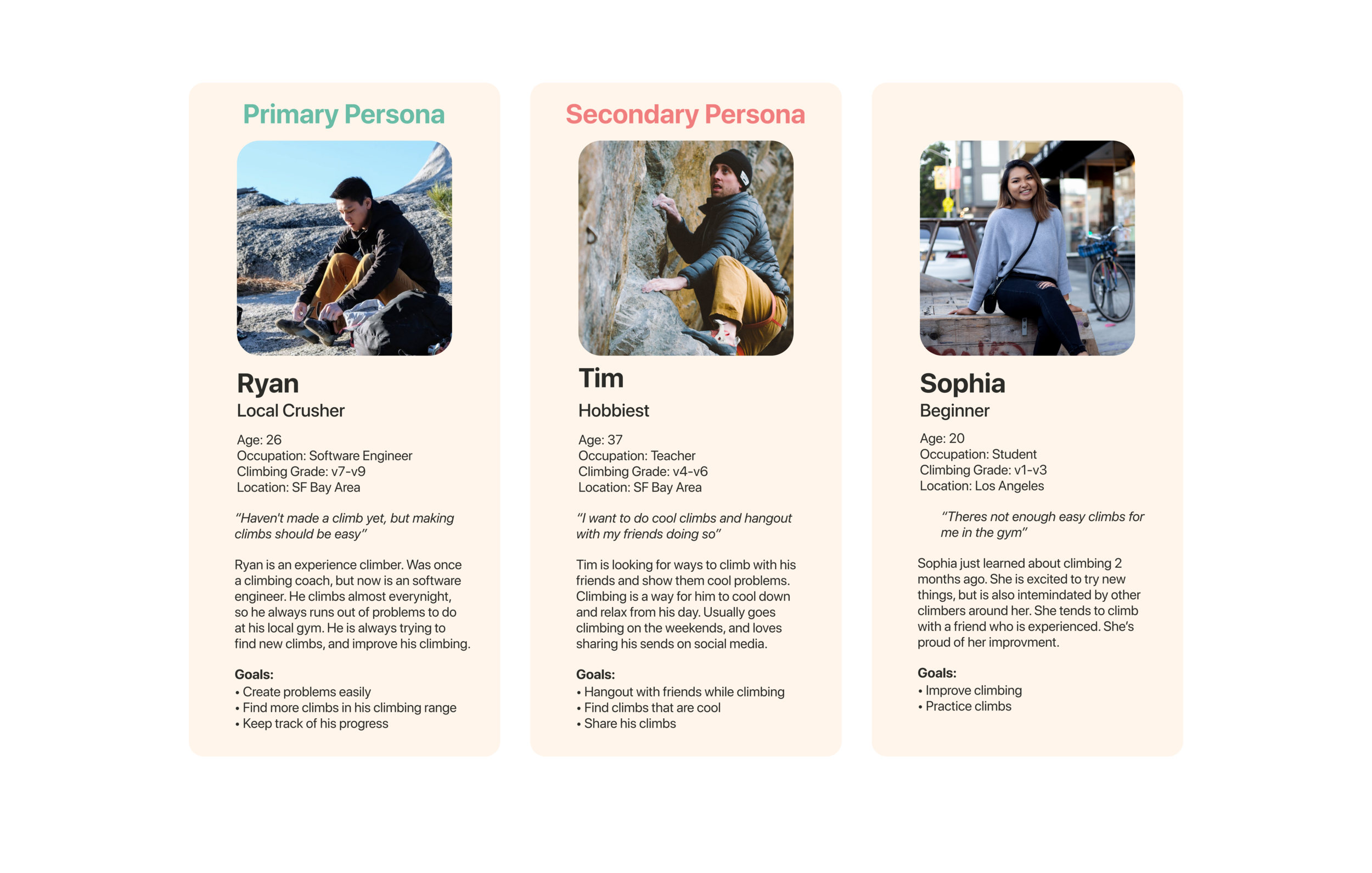
After setting my goals, I started assembling my personas to help guide me through the project. With a user in mind, it made it easier for me to make decisions on my designs. Based from the interviews that I conducted, here are the 3 personas that I created to help me throughout this case study.
Changing The Routes
Because the app has so many different features, it was difficult organizing these components into a concise but effective format that would allow smooth transitions from page to page. To solve this issue, I created an information architecture map to reorganize the structure of these features and make navigating within the app easier.
Information Architecture
Here is the original information architecture from the app.
Here is the new information architecture
The Changes
Menu
I began by reorganizing the pages by writing all the different pages down. Having all the pages on a white board made it easier for me to see everything the app had to offer. From there, I started reorganizing the pages based on my user personas.
The image on the left shows all the different possible routes that came from the menu page. Some of these pages can be combined or become options within another page.
Home Page
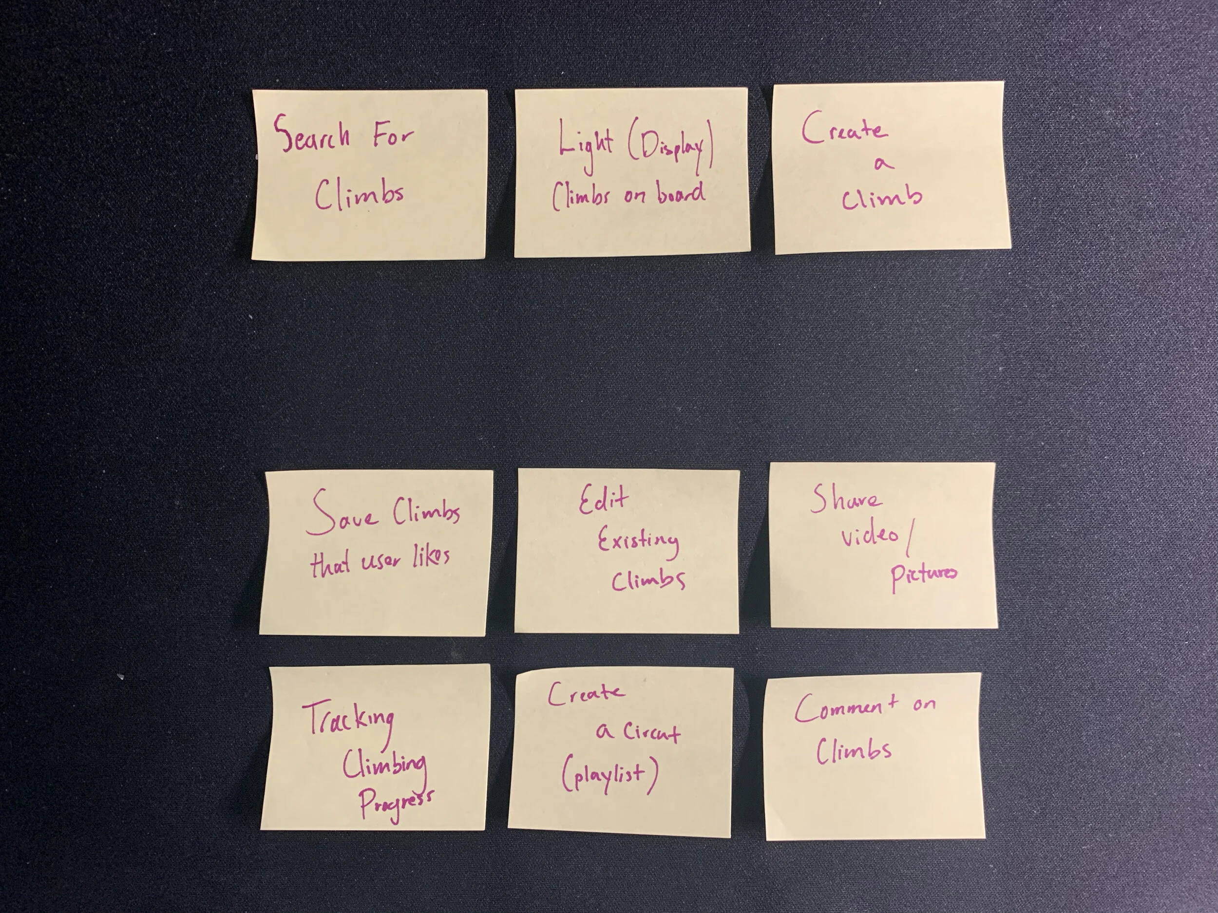
I started by writing all the features that the users use in the home page. After that, I organized the features in to two different categories. The top row shows the features that the users use the most, and the bottom rows show features that are not as frequently used.
I added the ability to share the climbs that the user is currently working on directly on the home page. Orginally this feature was in the menu page, but users had to scroll down to see it.
User Flow Chart
Based off my information architecture, I created a user flow chart. This flow chart is how my primary user would use the app.
Redesigning The App
After the creation of my information architecture, I moved on to redesigning the pages. My goal was to recreate elements that are consistent throughout the app. Since the original app is only optimized for an IPhone 5, I made sure that it would me optimized for an IPhone XS Max
Original Design
For reference, here are the original screens from the app.
Low-Fidelity Designs
I first created low fidelity designs to help give me an idea of how the app would look and function. I would then show these designs to users to get their input.
High-Fidelity Designs
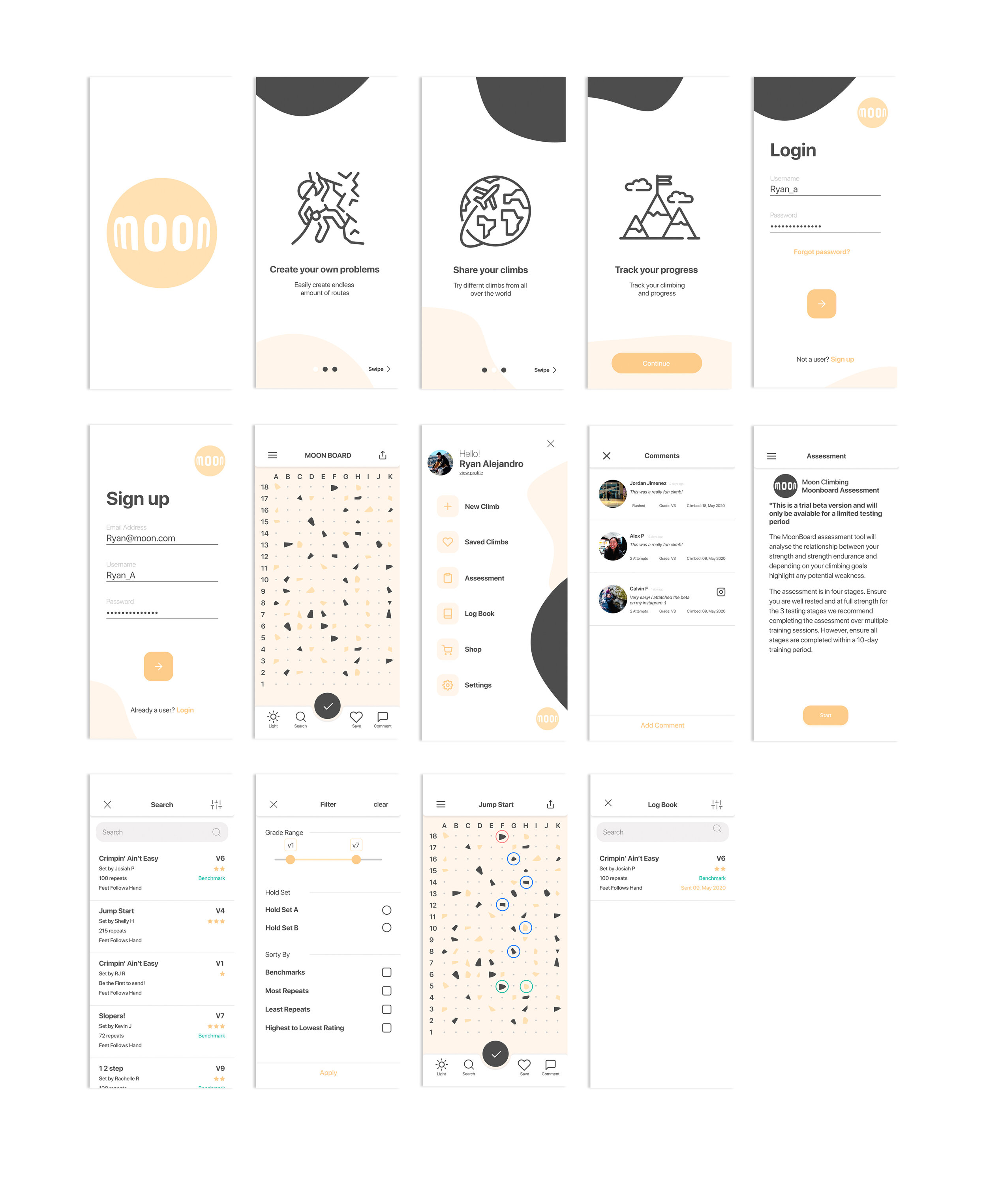
After going back and fourth with my low fidelity designs, I moved to the next step and created a high fidelity design.
Home Page
For the home page, I focused on updating the menu bar. I added new icons to help give hints to users to what they do. For further accessibility, I added labels to the buttons for less confusion.
I added the ability to save the climb. When the like button is pressed, the current climb will be saved to their “saved climbs.”
To help climbers share climbs, I added a share button on the top right. Users will be able to share their current route via a link or email.
Menu Page
I focused on only showing what is needed by my personas. Users will have an easier time of finding what they need without scrolling through a long list of features. Much of the features/tools on the old list have been added to other pages where it was more suitable.
Conclusion
When an app is used as a tool, users expect it to work with their pace. Anything that slows them down can decrease their progress. It’s important for an app to have routes that are easy to navigate through, and UI elements that help the user think less.
Design
The most important thing that I learned about from design in thise case study is that there has to be a reason for everything. Throughout this design process, I always questioned myself why I made something look a certain way, or why I placed a certain element in a certain spot.
Research
I made sure to take as much time as I can during my research process. Making sure I have clear goals was going to help me throughout the rest of the case study.
One thing I would have done differently during my research process, was to actually do on-sight interviews and see the users use the app. However due to Covid-19, it made it harder to talk to people in person.


